Become a MacRumors Supporter for $50/year with no ads, ability to filter front page stories, and private forums.
Status
Not open for further replies.

grahamperrin

macrumors 601
Jun 8, 2007
4,942
648
… Everything on your screen is content. Good UI understands this and understands the concept of tiered content and contextual content. This is why translucency is bad UI. It makes the least important content (your wallpaper) primary content by drawing the eye and focus of your attention to it.

Good UI uses shape, color, and depth to let the user easily move between his different tiers of content. …

A big +1 and to that, I could add:
  • the value of consistency and predictability.

Meanwhile …

That's a great example of translucency distracting the viewer from a video.
 

n-evo

macrumors 68000
Aug 9, 2013
1,909
1,731
Amsterdam
Yosemite with translucency looks like a Christmas tree. My poor eyes... They should call it OS X Acid.
You mean until a security issue comes up and the patch is to upgrade to Yosemite.
I swear, some of you are just complaining for the sake of complaining. OS X Yosemite allows you to reduce transparency to the point of being non-existent. Just pay a visit to System Preferences > Appearance or Universal Access. That's probably a reason to complain as well since you have to go all the way there to disable something huh?
 
Last edited:

VMukhtarov

macrumors regular
Mar 21, 2013
123
69
UA
I swear, some of you are just complaining for the sake of complaining. OS X Yosemite allows you to reduce transparency to the point of being non-existent. Just pay a visit to System Preferences > Appearance or Universal Access. That's probably a reason to complain as well since you have to go all the way there to disable something huh?
And watch at Windows 2000 style.
 

charlituna

macrumors G3
Jun 11, 2008
9,636
816
Los Angeles, CA
Yosemite is gorgeous and a refreshing, modern change. You're in the minority.

I agree that in general it looks better. I have an issue with the vast whiteness which makes me wish that the dark mode and it's grey scale tinting was a bit more widespread. Right now it seems to be only in the menu bar and dock. And I noticed that there's no button to get out of full screen mode. That is annoying. I'm okay with using the green dot to go in but there should be a dot to come back out. Especially after getting us used to those arrows.

And it took me only perhaps a month to get used to iOS 7. Now iOS 5-6 look awful to me. There are some features I want to see come back from them but not the UI
 

lupinglade

macrumors 6502
Oct 31, 2010
273
243
The main problem I'm seeing is glitchy/grainy text blending in the translucent menus and sidebars, especially in dark mode. It's so bad it's rediculous. Hopefully they don't think that is acceptable for release!

Also the close, minimize, full screen buttons' icons seem to be misaligned horizontally.
 

bbfc

macrumors 68040
Oct 22, 2011
3,910
1,676
Newcastle, England.
The main problem I'm seeing is glitchy/grainy text blending in the translucent menus and sidebars, especially in dark mode. It's so bad it's rediculous. Hopefully they don't think that is acceptable for release!

Also the close, minimize, full screen buttons' icons seem to be misaligned horizontally.

Dark Mode is obviously a work-in-progress so I wouldn't expect the menus to look like that in the GM release.

The traffic light alignment has already been discussed somewhere.
 

frgough

macrumors newbie
Jun 28, 2007
15
0
Considering they are still patching Lion, this isn't an issue for a while yet.

Apple has already stated that the patch for issues in Mountain Lion is upgrading to Mavericks, citing the fact that Mavericks is free and will run on any system that also runs Mountain Lion.
 

B-Eugen

macrumors member
Jul 26, 2014
66
16
I guess Apple now has so much business it can afford to alienate or dispose of about 20-30% of its customers.

I can tolerate Yosemite, but that's hardly what I'd call high praise. It seems sort of like I've gone from high quality prime rib (Aqua based interfaces in all previous OS X's) to a McDonalds 99 cent meal (Yosemite.) It just seems so utterly unprofessional looking.

I wish someone could explain to me the rationale for this change.
 

01mggt

macrumors 6502
Jun 23, 2010
309
11
I think Yosemite, like iOS7, is an amazingly fresh take that is long overdue. My only real appearance complaint that comes to mind is the traffic light buttons look a bit low quality but I am not using a retina screen either (should have never sold it!) I hope Ive continues to refine the Mac UI even further. Heck, iOS7 was one of the main reasons I finally went back to an iPhone! I found the interface so smooth and beautiful and well integrated vs every Android and even Windows phone I had used in the past!
 

ryuok

macrumors regular
Feb 27, 2011
164
158
Hong Kong
Well said. There is no style, culture or even coherency to the UI design of Yosemite. If you are going to give up something so well crafted and polished in favour of something 'fresh', you should have something profoundly innovative rather than patching up here and there with flatness or translucency to make things appear to be fresh.

I think that what we are witnessing is the beginning of the end for Apple. I thinks Jobs preferences dominated the design of their products in the past and he made his preference for life-like features in the OS part of the package...and his stuff was loved.

This is obviously gone. Look at all the complaints in this thread, just look at them. There's always somebody complaining about something whenever a new update gets released, but it's usually stuff like "And now Word won't work" or "Now my external drive isn't recognized." Complaints are now directed at the very core of the user interface itself.

The party is over. There is more than enough evidence that iOS 7 wasn't particularly well received by actual users (as opposed to publishers who stand to gain Apple advertising dollars by falling in line and being a bunch of Rah-Rah boys) and if you look at this and other threads on other sites, it's clear that Yosemite is going ahead regardless of what users think of it. If I had to guess I would say about 50% of the users think it's stupid looking.

I'd have to agree with other posters. The OS is cartoonish and infantile looking. I have no intention of placing something like that on my system and looking at it all day - no intention at all.


----------

What is so "fresh" about Yosemite?

I think Yosemite, like iOS7, is an amazingly fresh take that is long overdue. My only real appearance complaint that comes to mind is the traffic light buttons look a bit low quality but I am not using a retina screen either (should have never sold it!) I hope Ive continues to refine the Mac UI even further. Heck, iOS7 was one of the main reasons I finally went back to an iPhone! I found the interface so smooth and beautiful and well integrated vs every Android and even Windows phone I had used in the past!
 

.X.

macrumors member
Mar 15, 2014
38
1
What is so "fresh" about Yosemite?

Yes, what is so "fresh" about it? Personally I get a strong Windows Vista vibe from it... and I don't like that.

And why is freshness such a necessity? Wouldn't it be better to focus on quality?

I'm not saying it should look exactly the same forever, but throwing away a well-designed, polished and refined UI just for the sake of change seems a bit unnecessary. Especially when the new UI is both uglier and harder to use - and when the freshness effect has worn off after a short while, that is all that will remain.

By all means, improve the UI... But making it 2D and translucent just because Microsoft made theirs 2D and translucent isn't what I would call an improvement.
 

sleestak

macrumors newbie
Aug 1, 2014
18
19
When I first installed Yosemite and booted into it on my non-Retina MBP I despised it. Vowed to boot back into Mavericks and never return, but I decided to give it one more shot a few days ago. I turned off the transparency (which looked like garbage on my 13" non Retina screen) and used TinkerTool to switch my system fonts back to Lucida Grande. I'm really not liking Safari 8.0 either, so I installed Chromium (non Googled Chrome) instead.

I have to say I'm really liking the setup now...there are still a few visual things that bother me (new Finder icon, Trash icon, the blinding blue folders, etc) but overall I'm thinking this will be a worthwhile update for the non Retina folks with a little tinkering. The system seems to be a little quicker in general, and my memory usage is quite a bit lower on average versus while running Mavericks (a lot of that has to do with not running the memory hog that is Safari though).

My biggest complaint now is that I can't run Little Snitch, but that isn't Apple's fault and the developer can't be blamed for not creating an installer for a beta OS anyways.
 

scottsjack

macrumors 68000
Aug 25, 2010
1,906
311
Arizona
And why is freshness such a necessity? Wouldn't it be better to focus on quality?

I'm not saying it should look exactly the same forever, but throwing away a well-designed, polished and refined UI just for the sake of change seems a bit unnecessary. Especially when the new UI is both uglier and harder to use - and when the freshness effect has worn off after a short while, that is all that will remain.

Totally agree. It's all about the yearly O/S Fashion Show. Getting people to think last year's style is out and this year's style is in is what Apple is all about now. Whatever hardware performance increases are available is totally dependent on the current components from Intel, AMD and Nvidia.

So sad we can't just get a Mavericks, or even Mountain Lion, that just works flawlessly. With Apple the implication is that we should throw away both our hardware and software to we can live the latest new paradigm.

And yes, Yosemite has a certain slicked up Windows 8 look to it.
 

timshundo

macrumors regular
Jun 17, 2009
225
200
San Francisco, CA
I guess Apple now has so much business it can afford to alienate or dispose of about 20-30% of its customers.

I can tolerate Yosemite, but that's hardly what I'd call high praise. It seems sort of like I've gone from high quality prime rib (Aqua based interfaces in all previous OS X's) to a McDonalds 99 cent meal (Yosemite.) It just seems so utterly unprofessional looking.

I wish someone could explain to me the rationale for this change.

20-30% of their customers? Probably more like 0.1%.

I don't know what to tell you guys other than you're just gonna have to trust the designers.

A story:

When iOS 7 was revealed I was revolted. I was at work watching the Keynote with my co-workers and we had just finish designing the new version of our iOS app. Tim Cook came on stage and everything I knew about designing interfaces for iOS was thrown out the window. The circle on the App/iTunes Store was way too big! The colors are too neon! That helvetica is a ridiculous!

My thoughts on iOS 7 were more than just an opinion; it was a test to myself and my career. Apple got me interested in UI design when I was a kid. They have a world-class set of designers who have set standards for the rest of the UI world and have always pushed the boundaries. with iOS 7, they threw those standards out the window. If I were to disagree with what they put out, does that mean I'm not a designer? It was a crucial moment in my career. It's difficult to put into words what this all meant to me.

Eventually it was clear that either two things had happened: 1) Ive took over the design team and didn't know what the **** he was doing or 2) The designers were so good at what they do that they literally looked into the future and saw where iOS's design needed to remain modern/top-tier and not go stale.

It was 2.

By the time iOS 7 was actually released and my existential crisis was over, I had already grown to love it. Everything had a reason. So many rules were broken and it was for the better.

What I'm trying to say is simple: you'll get over it. You're gonna have to try your best to not feel like that's an attack. Put your stubbornness aside. The same thing that happened to iOS is now happening to Mac and the reason designers aren't blasting Yosemite's design choices like they/we did with iOS is because we've already seen this before. Ive and his team are world class. He/they have proven that since the unveiling of the first iMac, and then the iPod, and then the iPhone. They know what they're doing. What looks "elementary" and "unprofessional" to you will soon seep in and become the standard for high-class UI. It had to happen. Shedding iOS 6 and OS X's visual weight sets them both up for the future.

If we never test ourselves and only ever accept what we're comfortable with, our OS would still (visually) probably look something like this:

tSvw74w.png
 

timshundo

macrumors regular
Jun 17, 2009
225
200
San Francisco, CA
Should I have a field day with this one?

First of all desktop environment hasn't conceptually evolved since the days of Windows XP. Yes, windows on desktop formula is more productive than your iOS, Android mobile OSes but that doesn't mean there is no room for improvement to streamline it into 21t century. Since I have to give you ideas so you can make an image in your head I'll go ahead: Keyboards are missed opportunity to take away the clutter off screen, having an OLED screen with clear hardware keys will give you ability to map most of the menu items off the screen like Photoshop's tool panels for example, since you are a graphic designer. That means more room on your screen to blur pictures and put thin text over them. Which brings me to why translucent effect with thin text and contour iconography is not a good idea: It's barely legible!!! Your background is more important or has the same level of importance as your content. To their credit they toned it down in Yosemite compared to "lavishing" iOS7. Just because Apple or Ivey are doing it doesn't mean that its a proper thing to do. They just ran out of ideas.

That was hardly a field day. That was one example and I still don't get what you're talking about. Macs don't have on-screen keyboards? Are you talking about Microsoft's Surface? How does having a hardware keyboard, which computers have had since their inception, evolve the "inefficient" desktop environment.

I have no issues with screen space. In fact I have so much room on my screen that I'm able to double up my tool panels. So...

2Oguo0c.png
 

groovyd

Suspended
Jun 24, 2013
1,227
621
Atlanta
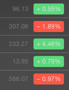
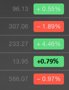
i open the notification center (for the first time ever actually) to see they conveniently have the weather (it was an ugly day), calendar events (i have none) and my stocks all quoted out. Wow, AAPL is up! Except it is in some lime green and the text telling me by how much is bright white and impossibly thin and the exact same brightness as the green around it. Here I am a mid aged man with good eyesight squinting to read the text on my 27" LED Cinema Display. Should this be happening I had to ask myself?

The content was a great idea, the colors and font were obviously not. How could that make sense to anyone? It isn't really even an argument, just common sense. I don't mind removing 'realism' from the interface but then again I didn't hate it either but when your sales line is getting out of the way of the information we now have to be immediately aware of everywhere (might be the last time i open the notification center actually because i already knew the weather and my events and stock) then give me legible text in a color i don't need to strain my eyes and get a headache looking at. It isn't even a question of fashion. Basic usability should prevail.

Simple test... look at the following image for half a second and tell me what is the number in the third green box? Don't cheat and squint or look twice or for longer then half a second. Now do the same with the second image and tell me which was easier?

:rolleyes:
 

Attachments

  • Screen Shot 2014-08-01 at 11.31.22 PM.png
    Screen Shot 2014-08-01 at 11.31.22 PM.png
    18.6 KB · Views: 584
  • better.png
    better.png
    16.1 KB · Views: 589
Last edited:

MacRobert10

macrumors 6502
Nov 24, 2012
287
46
Complaining about Yosemite on this site will do little good. Once again, if you're not a member of the beta program, tell them what you think of Yosemite using the following:


https://www.apple.com/feedback/macosx.html

If you would prefer to write a complaint, here's the address for that too:

Apple, Inc.
1 Infinite Loop
Cupertino, CA 95014

If you're in the beta program, follow the instructions for complaining and reporting bugs. Remember when they came out with the translucent menu bar in Leopard there were so many complaints about it that by the time the next release came out they offered a non-translucent menu bar.

Personally, I would like to see them offer BOTH the old interface and the new one, and let the users decide which looks better.

I would also have to agree with the other user that posted an estimate of 20-30% of the people not liking it, but I'd guess more like 20%. That's still a lot of dissatisfied, potentially lost customers.
 
Status
Not open for further replies.
Register on MacRumors! This sidebar will go away, and you'll see fewer ads.