Become a MacRumors Supporter for $50/year with no ads, ability to filter front page stories, and private forums.
Status
Not open for further replies.

grahamperrin

macrumors 601
Jun 8, 2007
4,942
648
… Feedback Assistant is great. I'm racking up my feedback tickets. …

The assistant can be great for the process of feedback.

Some of what's not discussed in public featured very strongly in my early Yosemite software-feedback to Apple. My conscience prevents me from saying more.

In the screenshot with parts blurred by me, Calendar was not a feature.

The second iCal episode was back in 2011 and ended with Apple's release of Mountain Lion. For anyone who's interested in the history: in Stack Overflow, To add a sidebar to iCal 5.x in Lion: is there an API, or would a hack be required?

The fundamental differences between iPhone, iPad and Mac hardware mean that there's only limited value in comparing the reactions of Yosemite users with the reactions of iOS users.

With a Mac, with the space for multiple windows, it's not uncommon to have those windows dragged around the screen by an end user – sometimes untidily (for many users, minimising to Dock is not something that's done naturally). For that reason and many others, there's some focus on what was most commonly used to drag, before Yosemite: the title bar.

https://forums.macrumors.com/posts/19441738/ compare some of what was said at WWDC 2014 with the current reality.

Worth repeating: I find most aspects of Yosemite beautiful …
 

MDTyKe

macrumors regular
Jun 24, 2007
173
41
Hawaii, USA
I'm incredibly disappointed by the Dark Mode. The menus are almost unreadable on non-retina MBP. It actually reminds me of the old Windows 98/ME menus when you could enable color on them.
 

MDTyKe

macrumors regular
Jun 24, 2007
173
41
Hawaii, USA
Note pixelation.. very difficult to read.

I was expecting the "Dark Mode" to be as beautiful and clear as say the Pixelmatr app. If you've ever used that, you'll know what I mean.
 

Attachments

  • screenshot 2014-08-05 at 4.26.54 PM.png
    screenshot 2014-08-05 at 4.26.54 PM.png
    303.5 KB · Views: 223

PsykX

macrumors 68030
Sep 16, 2006
2,755
3,935
Note pixelation.. very difficult to read.

I was expecting the "Dark Mode" to be as beautiful and clear as say the Pixelmatr app. If you've ever used that, you'll know what I mean.

Pixelmator, out of any of all these Pro apps, is the example you come up with ?

If anything, this app has one of the worst interfaces of all time on the Mac, because of its ultra-high contrast, combined with a white-on-black interface. If they chose dark gray instead of pure-black for their palettes, and if they chose light gray text instead of pure-white, and if they made their text labels and icons slightly bigger, now we'd be talking. In fact, Pixelmator 1.0 had a much better interface.
 

lparsons21

macrumors 6502
Jun 3, 2014
451
208
Southern Illinois
While I'll keep reading here and other places about the Yosemite beta, I'll be running Mavericks on my MBPr. My eyes have had enough of the pee-poor fonts, coloring and line widths.


Lots of things to like as long as you don't have to look at it! :(
 

KALLT

macrumors 603
Sep 23, 2008
5,380
3,415
I think this is a nice move away from the adolescent idea of doing things like a crapload of 3D effects simply for the reason that they can be done and they look cool.

So there are good reasons for the translucency and hair-thin typeface?

The more I use Yosemite, the more I get the feeling that the translucency is nothing but a gimmick. It is too strong to give you an idea of what is underneath. It only seems to mimic the colour, but it is too blurry to provide any contours. On one hand there is this frosted-glass effect that supposedly lets you see underneath, but the windows are also solid enough as to cast such thick shadows. It’s as if Apple desperately tries to make the translucency work, but can’t let go of the shadows and bevels. On iOS the translucency makes a lot more sense, as there is only one ‘window’.

The thinner typeface isn’t as sharp on non-Retina displays and its legibility leaves a lot to be desired. Apple optimised Lucida Grande, the current typeface, over the years to maximise legibility on all types of screens. It has been perfected. Now it’s all replaced with Helvetica Neue and the legibility is already an issue.

These are about aesthetics, simply for the reason that they can be done and look cool. Just as with iOS 7, I think Apple again just overdid it. It dropped some really good design practices for aesthetics. That’s such a shame.

Note pixelation.. very difficult to read.

The translucency looks very weird here. The menus seem to have a different gaussian blur than the menu bar itself. Also, the popup menu is more greyish than what is underneath. I expected the dark theme to be more black rather than just a shade added to the blur. The result is that the menu bar looks distinctly more black than the popup menus which end up dark grey instead (as on your picture).
 

cjmillsnun

macrumors 68020
Aug 28, 2009
2,399
48
Note pixelation.. very difficult to read.

I was expecting the "Dark Mode" to be as beautiful and clear as say the Pixelmatr app. If you've ever used that, you'll know what I mean.

Is that a fault of the non retina display or dark mode?

The reason I ask is attached. As you can see, I don't have the pixellation issues that you do.
 

Attachments

  • Screen Shot 2014-08-06 at 00.17.14.png
    Screen Shot 2014-08-06 at 00.17.14.png
    180 KB · Views: 271

MarsViolet

macrumors 6502
Mar 6, 2003
415
361
Note pixelation.. very difficult to read.

I was expecting the "Dark Mode" to be as beautiful and clear as say the Pixelmatr app. If you've ever used that, you'll know what I mean.

Plus the colors and grays are butt-ugly. Somebody please stop Ive. It's as if somebody put a mentally retarded circus clown in charge of Apple's user interfaces.
 

MarsViolet

macrumors 6502
Mar 6, 2003
415
361
Looks absolutely NOTHING like Windows 8.

It doesn't resemble the tiled Start page of Windows 8, but if you switch to the Windows 8 desktop, you start to see similarities, namely in the flatness of the UI. Ive is bring up the rear here. Microsoft was doing flat long before Ive invented it.
 

Miloh

macrumors newbie
Jul 8, 2011
19
0
It doesn't resemble the tiled Start page of Windows 8, but if you switch to the Windows 8 desktop, you start to see similarities, namely in the flatness of the UI. Ive is bring up the rear here. Microsoft was doing flat long before Ive invented it.

The only thing Metro (or rather Modern) UI and Yosemite/iOS 7 share is flatness in general.

Apple chose a more conservative flat UI that still retains everything about the previous iteration of Aqua, it is essentially a (very deep) reskin of Aqua versus an entirely new UI like Metro.

It also aids in keeping consistency between iOS 7+ and OS X so that those iOS users that eventually get a Mac will come in seeing familiar things.

Compared to early dev seed builds Yosemite is much improved and it will continue to improve. Apple has been tweaking the system font with every update to get it up to snuff on non-retina displays.
 

SarcasticJoe

macrumors 6502a
Nov 5, 2013
607
221
Finland
So there are good reasons for the translucency and hair-thin typeface?

I wouldn't call the Helvetica Neue exactly "hair thin", specially when you compare it to hand writing that isn't using tiny letters. As for the translucency, it's there to give you a heads up if there's something below the window that's currently active and if you don't like it, you can just turn it off.
 

KALLT

macrumors 603
Sep 23, 2008
5,380
3,415
I wouldn't call the Helvetica Neue exactly "hair thin", specially when you compare it to hand writing that isn't using tiny letters. As for the translucency, it's there to give you a heads up if there's something below the window that's currently active and if you don't like it, you can just turn it off.

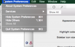
I admit, ‘hair-thin’ is probably not the best description, but the typeface definitely is too thin on non-Retina devices, especially at smaller sizes. It just isn’t as sharp as Lucida Grande, neither on my MacBook’s own display nor on my external 24 inch display.

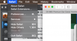
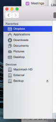
My qualm with the translucency in Yosemite is that it doesn’t seem to add anything, unlike in iOS. Not only is the gaussian blur too strong, but the added glow makes the blur even less useful. Look at the screenshot below, the sidebar of Finder. The left half is my dark wallpaper, the right half another window with a very bright background. You can barely see the difference, you can’t actually see through it. It only mimics some of the underlying colours, nothing else. Look also at the screenshot of Safari. Facebook has a dark blue header, but the translucency changes it into a bright, light blue colour blob. Again, it doesn’t really give you an idea of what is underneath, it just mimics the colour (in this case it turns it into a tint).

Safari’s toolbar looks pretty terrible on websites with lots of images. While scrolling though Netflix, with lots of film covers, the toolbar lit up like a colourful Christmas tree with every scroll. It reminded me of those old Geocities homepages with lots of animated GIFs and horrible colour combinations. It looks extremely tacky and it is actually distracting to some extent. It just doesn’t look nice to my eyes. But the more important part for me is that it also doesn’t add anything, it’s just aesthetics.

You can turn off the translucency of course, but I found that to be even worse-looking. When you turn it off, it will affect all instances of that translucency, including the menu bar, Notification Center and the Dock. While windows and sidebars look nicer, the Dock in particular looks horrible. It becomes almost solid light grey, even with the dark mode (see the screenshot).

I hope this is just a work in progress and that Apple will tweak the translucency a lot more. As it currently looks, I cannot see the benefit of it other than adding an effect just for the sake of it. Mavericks is just more beautiful to me.
 

Attachments

  • Screen Shot 2014-08-06 at 13.28.12.png
    Screen Shot 2014-08-06 at 13.28.12.png
    51.6 KB · Views: 174
  • Screen Shot 2014-08-06 at 13.36.19.png
    Screen Shot 2014-08-06 at 13.36.19.png
    27.6 KB · Views: 152
  • Screen Shot 2014-08-06 at 13.27.27.png
    Screen Shot 2014-08-06 at 13.27.27.png
    97.5 KB · Views: 154
  • Screen Shot 2014-08-06 at 13.26.05.png
    Screen Shot 2014-08-06 at 13.26.05.png
    96.3 KB · Views: 175

vpro

macrumors 65816
Jun 8, 2012
1,195
65
some...

Some icons need a facelift for instance the calendar etc, where they are on an angle, yuck, i like it all round or round and square (round edges). I LOVE the flat look and very simple (Zen) concept, truly what the Mac was meant for aesthetically, so finally they are getting the UI design to the same philosophy. I have switched all my Macs icons to iOS 7 style icons and not looking back to previous semi 3d/2d icons which took up way too many pixel surface area for me to look at was a pain and not clean looking at all. Now it is crisp, clear and meaningful everything is so well defined. I'm an artist so I "get it".

I love all the independent developers work out there creating cool apps to help me further customize the look and feel of my UI - so way to go people keep up the incredible creative work!

My current customized UI look is simply gorgeous and I feel good to be working on all my Macs more than ever!

Simple is sexy.

----------

In red above ^^^

i want more translucency if they can make it even more that would be really slick!
 

bbfc

macrumors 68040
Oct 22, 2011
3,910
1,676
Newcastle, England.
It doesn't resemble the tiled Start page of Windows 8, but if you switch to the Windows 8 desktop, you start to see similarities, namely in the flatness of the UI. Ive is bring up the rear here. Microsoft was doing flat long before Ive invented it.

I disagree. It's a completely different route than what MS did with Windows.

Apple took a UI that had been perfected over the years, and applied a new skin to it. It still functions the same and does the same things. Theres no 'touch-friendly' huge boxes or big buttons.
 

ZVH

macrumors 6502
Apr 14, 2012
381
51
Translucency is a BAAAAAAAAAAAAAAAAD idea!

Yesterday I visited a web page and the page had an orange-yellowish border with blocks of blue and white content. I should have gotten a screen shot of it but I didn't. It caused the screen and Safari to render the ugliest color combinations I've ever seen. No one in their right mind would deliberately set a display to look like that but it's an artifact of translucency.

I suspect this is the exact same reason they needed to stop forcing people to use the translucent menu bar in Leopard by providing a non-translucent one. Did it not occur to Apple that if translucency more or less fell on it's face once it wouldn't do so again, with the exception that now it's not just a novel item isolated to the menu bar but it's actually all over the screen?

Another point is that the new flattened white buttons look more like text fields than controls. I thought the purpose of 3D effects on controls was more or less standard and the 3D effects were used to segregate controls from text input areas. That's what I thought...now they're the same.

MacRumors is one of, if not the most visited independent website about Apple products on the web. It shouldn't come as a surprise to anyone if some of Apple's "Team Marketing" members show up here and try to "sell" us on their ideas, after all they may be the people pushing this change to the higher ups. I guess putting lipstick on a pig and then trying to convince everyone it's really a Sports Illustrated swimsuit model may work on many, and it may even work on a considerable number, but only for a while. Eventually people will see it for what it is.

The UI in Yosemite is a very poorly designed and very poorly thought out.
 

MagnusVonMagnum

macrumors 603
Jun 18, 2007
5,196
1,452
20-30% is presumptuous arrogance.

Don't confuse those who would refuse to update BECAUSE of the GUI changes from those that simply DON'T LIKE IT. I'm in the latter camp. Some changes are OK, but the cartoon look of window decorations I'm seeing in snapshots undermines every single version of OS X that's ever been released thus far (i.e. it's been a constant and to me the "symbol" of OS X's "look" compared to OS9 or even various Windows incarnations. It's instantly recognizable. The "gel" look (Aqua) should not be completely eliminated unless they're ready to move to OS 11 (i.e. that's when the OS9 window decorations changed). Honestly, how anyone could actually prefer the "flat" cartoon look to the current interface is mind boggling beyond me. It's SO UGLY it's UNREAL. There were some flat themes for Windows 3.1 and early X-Windows. Do we really want to go back to that chintzy GARBAGE look? Flat buttons and flat traffic lights. God it's ugly.

iOS 7, less than a year out is at a 90% adoption rate. Theoretically, if you wanted to stubbornly assume that that missing 10% were all users who refused to upgrade because they don't like the look of iOS 7, that's still less than 20-30%. Apple is not "disposing" 20-30% of their consumer base because of a visual update.

Like I said, it's ABSURD to assume people wouldn't upgrade JUST because of the looks. I'm sure a few would, but let's face it, updating the hardware means getting the newer OS whether you like it or not at some point and that will inevitably be true of OS X as well when software support dries up. You cannot ASSUME that because people have upgraded for practical reasons like improved (no GUI) features or even the simple ability to run updated versions of software (kind of important to most) that they somehow "approve" of the GUI changes.

If you REALLY want to know some actual figures of GUI approval instead of making these wild guesses, you could create a poll on the matter, although it would be more accurate once the final version of Yosemite is released. Simply asking about the GUI rather than all of the features will be far more accurate than basing it on how many have upgraded. Most people do not upgrade based on GUI looks, but rather they need to run newer software and/or want newer functional features (e.g. Mavericks updated OpenGL to 3.x). Do you really think most people holding out with Snow Leopard are doing it because of GUI changes? There may be a few, but most hold onto it for the ability to run older software (e.g. Rosetta still works) and/or perceived stability reasons with the software they run most often. I remember a ruckus about changes to Spaces, but I doubt it visually ran much further aground than that.

When it was released, iOS was widely panned because of how shocking the difference was. No one was ready for it. Everyone wanted to have an expert design opinion. Everyone wanted to hate. This is not a phenomena unique to Apple's followers.

Yes, and it is still UGLY. But people get newer hardware and are FORCED to run it or switch platforms. Don't confuse adoption with preference. I assure you they are NOT the same thing.

Those cries have all been nullified. You'd think with the outrage we were hearing back then that 20-30% of users who hated iOS 7 declared to never upgrade. But alas, numbers speak for themselves.

Sorry, but like I said, your statement has ZERO validity. Adoption of newer upgrades has NOTHING to do with the GUI appearance since Apple FORCES you to upgrade when you buy newer hardware and the shelf life of iOS devices is a a year or two on average. Combine that with software developers DUMPING SUPPORT in newer versions for iOS6 *long* before that and you have valid reasons to upgrade despite the problems of iOS7. A more valid reason to not upgrade would have been slow performance on older devices. But that does not mean people prefer the GUI looks of iOS7. You simply CANNOT make that logical leap for said reasons and to do so shows a total lack of logical thinking, IMO.

You're also crazy if you think the design team has any influence on... updated graphics drivers.

You assume there is a difference between the design team and any other team. Apple moves developers around like musical chairs. If you think Johnny Ives is incapable of anything but artwork, you're sadly mistaken.
 

Don MC

macrumors regular
Nov 25, 2010
103
52
Finland
Is that a fault of the non retina display or dark mode?

The reason I ask is attached. As you can see, I don't have the pixellation issues that you do.

What the...? My menus aren't transparent like yours. My dock is, but not the menus. They're dull grey, like MDTyKe's menus. What's up with that? I'm on PB1.
 

grahamperrin

macrumors 601
Jun 8, 2007
4,942
648
… Apple chose a more conservative flat UI that still retains everything about the previous iteration of Aqua;

No. Not everything.

More specifically: some of what's possible with the new UI can be regressive.

The appearance of Safari 8 exemplifies an Apple approach to regression that can not be rectified by the end user.

If third party developers follow that Apple example – if developers fail to realise the regressive effects on some users:
  • things will become problematic for a broader range of users.

Simply: Apple should be setting the best possible examples, especially with its most popular/important apps. I see reasonably good examples with some apps, but that's not good enough. That's not Apple at its best.

A fifth developer preview without the best possible consistency across the user interface?

A mashed-up UI might be expected from, say, Microsoft. From Apple I expect the best (not necessarily the most popular).

It also aids in keeping consistency between iOS 7+ and OS X …

An equally important consideration: the design of OS X should be good for someone using a single device for the first time. That device: a Mac.

OS X alongside iOS: there was enough consistency, good consistency, before Yosemite.

Mac hardware is very different from iPhone and iPad hardware. Some of what Apple is doing with Yosemite significantly reduces usability for some users.

… Apple took a UI that had been perfected over the years … It still functions the same and does the same things. …

No. In places, functionality has been removed.

Yosemite, as it currently appears, is well and truly crapping over some of the best of the established human interface guidelines (HIG).

If I was a developer who had contributed to the perfectionism of Apple's past, I would be insulted by some of the recent destruction. There's too much novelty/change for the sake of change; too many forced gimmicks that have only limited logic.

… Some changes are OK …

+1

The "gel" look (Aqua) should not be completely eliminated unless they're ready to move to OS 11 …

The best human interface guidelines should apply to OS X until OS X becomes a legacy operating system for Mac hardware.

… it's ABSURD to assume people wouldn't upgrade JUST because of the looks. I'm sure a few would …

Words such as appearance and looks are vague enough to cover a huge variety of issues. Some assumptions may be less absurd than we think.

I look for something fundamental, it's no longer there. Yeah, the look of the OS has changed but it's also a regression, a bug – one that may be critical.

… updating the hardware means getting the newer OS whether you like it or not at some point

That's one of my reasons for backing away sooner rather than later.

There's much to love in pre-release Yosemite, but also enough gone wrong for me to be seriously concerned, that the mistakes that are still present – after four rounds of testing - will perpetuate beyond 10.10.x.

OS X might become more popular, but at what cost?
 

n-evo

macrumors 68000
Aug 9, 2013
1,909
1,731
Amsterdam
Note pixelation.. very difficult to read.

I was expecting the "Dark Mode" to be as beautiful and clear as say the Pixelmatr app. If you've ever used that, you'll know what I mean.
It's a problem with the font smoothing option that hasn't been optimized for the dark menu bar en Dock. I'm sure it fill be fixed. When disabling font smoothing things suddenly look a lot better, especially the Menu Extras per example. Unfortunately fonts look worse in apps like Safari.
 

lparsons21

macrumors 6502
Jun 3, 2014
451
208
Southern Illinois
Played with some settings after reinstalling Yosemite beta.


On my external non-retina display I was having difficulty reading and enjoying the interaction.


So I changed the display contrast in system preferences accessibility section, didn't select the 'increase contrast' or 'reduce transparency' tickboxes and things are looking pretty good.


Coupled with the changed system fonts, all is much better.


One thing that I found is that with my use of iTunes and its library being on a NAS, after the upgrade to iTunes12 beta, the .itl file won't allow for iTunes 11.x to use the library.
 

hamis92

macrumors 6502
Apr 4, 2007
475
87
Finland
One thing that I found is that with my use of iTunes and its library being on a NAS, after the upgrade to iTunes12 beta, the .itl file won't allow for iTunes 11.x to use the library.

Upgrading iTunes to a newer version and launching it for the first time makes some changes to the library file as well. Libraries touched by newer versions of iTunes are not compatible with earlier versions.
 
Status
Not open for further replies.
Register on MacRumors! This sidebar will go away, and you'll see fewer ads.