Become a MacRumors Supporter for $50/year with no ads, ability to filter front page stories, and private forums.
Status
Not open for further replies.

mrbyu

macrumors 6502
Jul 5, 2011
325
65
As for me, there are some things that still look strange to me, but there are things that I instantly found way nicer / better than their Mavericks counterpart. E.g. the dock and the icons look beautiful imho (oh, and the dark dock and menubar scheme, let's not forget about it!). When playing with the beta, I started to love tha flat dock so much that I couldn't stand the 3D one in Mavericks so I put it on the left side of the screen where it uses a flatter design in Mavericks too. I also changed the system icons in Mavericks to the Yosemite ones. Surprisingly enough, they actually look sharper and better to me even on a non-retina device than the old skeumorphic icons. Helvetica Neue must look best on a retina screen, on my MBA it's not super crisp, but legible enough. However, I can imagine that on a non-retina, non-highres MBP (which has a lower pixel density than the MBA) it's too blurred.

Guys, I guess it will turn out to be a very good design direction in the end as things get smoothet out. Remember how iOS 7 used some very harsh green colors at the beginning and then they gently altered them (I mean the phone and messages icons)? I think the same will happen with Yosemite, if not with the incremental updates, but next year's version might be refined where it needs. Good thing of the "new Apple": they are indeed listening to the customers, and I don't doubt that in 1 or 2 years we all will remember Mavericks as we remember Jaguar or Tiger now. ;)
 

bluedoggiant

macrumors 68030
Jul 13, 2007
2,634
94
MD & ATL,GA
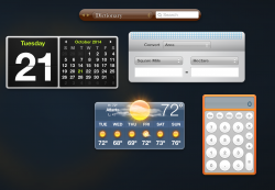
No it doesn't... It has changed significantly during the years. The whole interface of managing widgets is very different from Tiger.

Alright thats if you spend your time in the widget management interface.

But the widgets themselves have not changed visually...
 

Attachments

  • Screen Shot 2014-10-21 at 2.16.22 PM.png
    Screen Shot 2014-10-21 at 2.16.22 PM.png
    421 KB · Views: 83

grahamperrin

macrumors 601
Jun 8, 2007
4,942
648
What a mess

… Compare XCode 5 on Mavericks to XCode 6 on Yosemite. …

J.H.F.C.. Selfishly, I'm glad that I abandoned feedback when I did. At one point, early on, I was virtually SCREAMING (SWATHES OF UPPERCASE) in Feedback Assistant about the unhelpful mess that Apple was creating with some other apps.

If I had stumbled upon that dog's dinner of a design in Xcode I would have abandoned feedback even sooner. I don't doubt that some people (at least, a designer) perceives some improvement but frankly, that shot of Xcode in Yosemite is – to me – another indication that someone, or some group, at Apple is happily going just a little bit ****ing mental

No it isn't ****ing ugly.

Dear God of Technology: some people profanely beg to differ.

Give it another week and you'll all be used to it and happy. ….

All? Generally, that notion was proved wrong weeks ago. I can't blame you for not properly reading such a long topic.

Funny how these changes grow on you and the whole thing reverses. …

I'm genuinely pleased for the people who can change in that way but for more than a few people, Apple has chucked some crap that sticks, long term, and the smell only gets worse with the passing of time. Maybe only a tiny minority of customers are reeling at the stench but WTF has happened within Apple for something like this to happen?

It can't be explained by resistance to change. Apple, please, cut the crap.

What's Yovomite?

Maybe an early symptom of Yosemititis.

Sounds NASTY. Ew.
 
Last edited:

nomore

macrumors member
Feb 11, 2005
92
0
In OS X Yosemite all toolbar items have the same background. IMO that makes things more consistent, not less. I actually prefer the OS X Yosemite shot you provided. The OS X Mavericks shot just looks messy to me.

Consistency is much overrated. Differentiation is just as important as consistency. If a button and an information panel look identical, that is not helpful, but calls into question the way in which it works, and the way in which to have interaction with the controls.

Users should not be expected to reverse engineer design decisions.

Also, I think the white boxes and outlined icons are much more visually cluttered than the previous, more elegant design. This is more an example of change for change's sake.
 

trevymond

macrumors newbie
Dec 11, 2008
5
0
I don't think that new interface looks all that good, but don't think it looks bad either. Not nearly as bad as my initial reaction to iOS 7. I still think it is funny that Apple refers to it as "modern". If anything going back to simplistic designs (plain flat icons, lots of white etc.) is retro.
well in a since modern in retro... retro is the new modern
 

grahamperrin

macrumors 601
Jun 8, 2007
4,942
648
Shame on the designers of the troublesome parts of Yosemite's UI

… Users should not be expected to reverse engineer design decisions.

… change for change's sake.

Agreed. Agreed. That a thing can be done does not mean that it should be done.

I'll be flamed for this, but here goes. I think that Apple would not have made such a mess of things – a mess for so many people – with Steve Jobs as a decision-maker. That's truly no offence to Tim Cook, and I was never acquainted with Jobs as a person, just … simply: from what I know of Apple over the decades, I can not believe that the development of the appearance of Yosemite is a development that would have met with approval from Jobs.

I can't emphasise this enough: my first and lasting impression of the pre-release was disbelief. I could not believe that something so far below the standards associated with Macintosh/Mac was thought suitable for alpha or beta testing by anyone outside Apple.

It is horribly divisive.
 

bflowers

macrumors 6502a
Jul 19, 2006
636
136
My opinion is that it looks horrible. I haven't upgraded my desktop yet as a result. I'll see if I get used to it on my seldom used MacBook, but so far it is making my eyes bleed worse than iOS 7 did. That took a month or more of daily use to fully acclimate.

What I wouldn't do for custom skins...
 

Proginoskes

macrumors member
Oct 19, 2014
52
2
Tempe, AZ
If you don't like Helvetica, you're in luck

Instead of just complaining, I am trying to be proactive about the look of 10.10. Ive managed to change application icons, but no idea how to change anything else to resemble mavericks. Has anyone gotten anywhere with this? Specifically, Im looking to change the orbs (close, minimize, maximize) back to their beautiful glory.

If you don't like Helvetica (I never have, because of the way it kerns), you can change the system font somewhat:

https://github.com/jenskutilek/FiraSystemFontReplacement

In addition to giving you Fira Sans fonts, this page also tells you how to change the font which is used for the toolbar at the top of the screen.

However, there are two bugs: (1) The baseline for the program name isn't right. (2) When a window pops up that asks you for your password (to change settings, for instance), gibberish shows up. This may be due to the lack of characters in the Fira Sans font table, though.
 

tkermit

macrumors 68040
Feb 20, 2004
3,586
2,921
Developers spent so much time along the years perfecting GUI renderings for this?

Considering that there's arguably a lot of superfluous although optional translucency and certain UX issues, I'm not necessarily saying that they were completely successful in applying their design principles to the software UI at hand, but it seems to me the philosophy behind Yosemite's interface design at least in part closely aligns with the following:

To use design to impress, to polish things up, to make them chic, is no design at all. This is packaging. When we concentrate on the essential elements in design, when we omit all superfluous elements, we find forms become: quiet, comfortable, understandable and, most importantly, long lasting.

At the height of the skeuomorphism trend at Apple, they tried to literally copy the look of this object's user interface and use it in a software product, now they're going for the principles behind it:
 

Attachments

  • dietersystem.jpeg
    dietersystem.jpeg
    85 KB · Views: 108

shanson27

macrumors 68020
Nov 27, 2011
2,229
21,232
Back in time with snow leopard :D screenshot from 2011-09-24. So what do you guys think, you still like it ?

Bildschirmfoto%202011-09-24%20um%2023.34.55.png
 

cube

Suspended
May 10, 2004
17,011
4,973
Considering that there's arguably a lot of superfluous although optional translucency and certain UX issues, I'm not necessarily saying that they were completely successful in applying their design principles to the software UI at hand, but it seems to me the philosophy behind Yosemite's interface design at least in part closely aligns with the following:


At the height of the skeuomorphism trend at Apple, they tried to literally copy the look of this object's user interface and use it in a software product, now they're going for the principles behind it:

There is such thing as oversimplification. A flat design is less user friendly.

This is what happens when you put the person in charge of oversimplified hardware to also oversee GUI design.
 

tkermit

macrumors 68040
Feb 20, 2004
3,586
2,921
There is such thing as oversimplification.
I agree. And I'm not sure they've struck the right balance yet. My feeling is that it's unwise to be dogmatic about flat design, but I don't get the impression that Apple is. You only need to look as far as window shadows or the (admittedly very) slight retention of a 3D effect in certain UI elements... For sure I expected worse. :p

sl.png
y.png
 

mrbyu

macrumors 6502
Jul 5, 2011
325
65
I agree. And I'm not sure they've struck the right balance yet. My feeling is that it's unwise to be dogmatic about flat design, but I don't get the impression that Apple is. You only need to look as far as window shadows or the (admittedly very) slight retention of a 3D effect in certain UI elements... For sure I expected worse. :p

sl.png
y.png

You happened to demonstrate a good example of something I very much like in Yosemite. I mainly use preview for, you know.... viewing my things, not editing them. So I welcome that those obtrusive buttons in SL don't distract my attention. Emphasizing buttons makes much more sense somewhere where you are actually regularly using them, like in a word processor. See how they brought back some life into the toolbar of Pages? (sorry for the funny-looking language, it's Hungarian :))

y_pages.png


Actually, I'm not even sure if I like this very much even in Pages, because this harsh color palette can get a bit too distracting. But since I can always hide the toolbar, it's not much of a problem to me. But otherwise I really like that with Yosemite (and iOS 7) Apple is trying to emphasize GUI elements with colors rather than skeumorphism (one must admit, Microsoft got this right with WP7 way before, when Apple was still bathing in fancy skeumorphism). A lot of people were complaining about how Lion lost all of its friendly colors. Now they are bringing back some colors, and this time this is the problem? I welcome the flattening, and also the tendency of recolorizing some parts of the GUI.
 

OneTrueDabe

macrumors newbie
Oct 21, 2014
2
0
Back in time with snow leopard :D screenshot from 2011-09-24. So what do you guys think, you still like it ?

Yes, yes, a thousand times, "Yes!"

The word I use to describe Yosemite is Cartoonish.

(Maybe it's not California landmarks, but Looney Toon characters — as in Yosemite Sam... 10.11 will be "Daffy"; 10.12 "Porky"; and, of course, 10.13 "Bugs".)

What the Snow Leopard image above shows — particularly in the Dock — is a very subtle (and highly effective) use of depth; I would call it "2.5D". It *LOOKS* like it was made by highly paid professionals!

In Yosemite, the Dock and App Switcher (CMD-Tab) look like they were done in PowerPoint.

Tell me why, exactly, I should spend $2500 on a "5K Retina Display" iMac when all it's going to be used for is drawing plain white rectangles??
 

tkermit

macrumors 68040
Feb 20, 2004
3,586
2,921
Tell me why, exactly, I should spend $2500 on a "5K Retina Display" iMac when all it's going to be used for is drawing plain white rectangles??

If you're planning on doing nothing but look at the operating system's GUI elements all day, you don't need a Mac (or a computer for that matter) in the first place.
 

nomore

macrumors member
Feb 11, 2005
92
0
Tell me why, exactly, I should spend $2500 on a "5K Retina Display" iMac when all it's going to be used for is drawing plain white rectangles??

If you're planning on doing nothing but look at the operating system's GUI elements all day, you don't need a Mac (or a computer for that matter) in the first place.

Your reply is nonsense. People (used to) pay premium for Apple products not just because of what you can do with them (because you can do the same with Windows), but also because of the amazing attention to detail. The sheer quality and craftsmanship. White and grey rounded rectangles are not craftsmanship.
 

OneTrueDabe

macrumors newbie
Oct 21, 2014
2
0
If you're planning on doing nothing but look at the operating system's GUI elements all day, you don't need a Mac (or a computer for that matter) in the first place.

I think the point is: you can't get AWAY from looking at those things all day...

Earlier, you quoted Dieter Rams:

When we concentrate on the essential elements in design, when we omit all superfluous elements, we find forms become: quiet, comfortable, understandable and, most importantly, long lasting.

This new look is anything BUT "quiet" and "comfortable". It's Little Tikes; it's Playskool; it's fine if you're a toddler, but there's a reason that the top colors for cars are white, silver, black, and gray.1

They might as well have switched the system font to Comic Sans.
 
Status
Not open for further replies.
Register on MacRumors! This sidebar will go away, and you'll see fewer ads.